Module Evaluation
Design Context
Wednesday, 14 January 2015
COP 3 - Practical Boards
Practical Boards
Synthesis/Rationale
Rationale
The
brief submitted in relation to the written element offers and example
of successful brand. The Cari+Carl rebrand has been chosen to demonstrate
the research taken. The owner of the brand is interested in the structural
form; the plus sign between then name cari+carl has been made up of
shapes to represent this interest.
The existing
company is a bespoke knitwear brand. The knitted accessories are crafted from
enticingly tactile and intriguingly structural fabrics using luxurious
materials. A rebrand has been put in place due to the previous logo and
branding not demonstrating a high end feel to the consumer.
‘It
is about creating an entity in the consumers mind so that they can see it. They
can see a representation but behind this representation what they actually have
is a whole series of images beliefs and actions. Effective branding is the
means by which a brand can stay in a market longer and more profitably because
its been created properly.’ Michael Hockney, Chief Executive D&AD
The
rebrand features collateral such as: packaging box, tissue paper,
stickers, clothing tags, personalised notes + invoices. To
showcase some existing high end images of the scarfs a look book had also been
produced. The colour scheme used has been expanded from monochrome to
white black and grey. This minimal scheme works well with the simplistic logo
and design and compliments the over all character of the brand giving it
a contemporary feel.
Friday, 9 January 2015
Photography
Photography
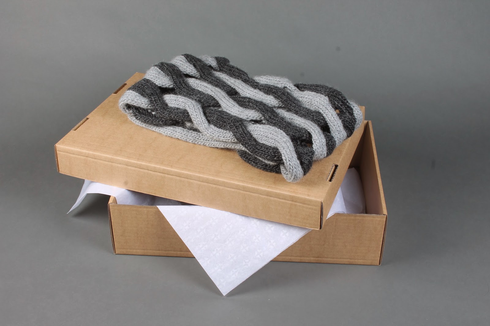
For the practical part of the brief i wanted to photograph the branding i had produced so i could use images from the photography slot to use on boards, behance and for my submission. I used two lights large grey roll and displayed my work onto a table. I loved the setup and i feel it worked really well.
Images used-
Edited images used for boards -
Wednesday, 7 January 2015
Digital Branding
Cari+Carl
I decided to update some of the digital branding used for Cari + Carl. Using Facebook as an example.
Existing Facebook page-
Profile Picture -
I first began by designing a profile picture for the Facebook by using the same colour scheme and then adding the logo on to the middle.
I chose grey so the image wasnt to plain on the Facebook page
Cover photo-
For the first upload i added a picture of the scarf inside of the cardboard box.
For the cover photo i used the cari + carl logo but in the reverse having the text black on white.
I didnt feel like it worked properly as a whole so change the image to one from the look book and had a full bleed image of the material.
I think it looks much more professional and high end.
I made the mockup into one large image so i was able to add it to a mockup screen.
I am really pleased with the newer Facebook page although the old one was similar i feel my revised version is more contemporary.
Tuesday, 6 January 2015
Printed work - Production
Production
Wrapping - I decided to produce wrapping which is simply the pattern which is put on to the tissue paper, but the wrapping has been printed onto true grain. This wrapping is extra and could be used to initially wrap everything with in the box. The wrapping was slightly to large so i needed to trim it to fit it in the box.
Clothing Tags- For the clothing tags i used really thin shoe lace string to hand or attach the card from. To make the holes in the stock i pierced the card with the scalpel in a circular motion until the hole was large enough for the string.
Although this method wasnt the best as it left some of the card slightly frayed it was the perfect size hole as using a hole punch would of been far to large.
Business cards-
I cut the business cards out using a scalpel , the stock i used was a thick gsm so i was really happy with the thickness and style of the business cards.
Personalised notes-
For the personalised notes i printed these double sided with the name at the top and the pattern on the back.
Invoice-
I bought envelopes to put the invoices in keeping the colour scheme.
Belly Bands-
The belly bands i had designed were minimal as i was designing stickers i didn't want there to be to much at the front.I also made plain grey belly bands as well so i could choose after i had cut them out which one worked best.
Sticker sets-
The sticker sets i had made worked out well. As i had produced them a4 landscape i decided to cut them into strips so i could put the belly bound around them.
Belly bands around the stickers-
Vinyl- using the vinyl i had produced i chose which one would work best for the size box i had. Then i began cutting around the words and plus sign leaving the sticky transfer tape on top.
I peeled off the white backing of the vinyl and then using an average size logo i placed it in the centre transfer the text onto the box.
I am really pleased with the range of printed material i have i feel like it reflects the brand and everything works as a set.
Subscribe to:
Comments (Atom)


