Part 1
- Cern - The internet was created 1991 - Switzerland
- Started 1991
- Tim Burnerslee
'' To link and access information of various kinds as a web of nodes in which the user can browse at will''
- Web serves - steve jobs NeXT

- 1992 worlds First image - ' Les horribles cernettes'

- universal file format
Part 2
Terminology
- All websites use codes
- Encoding - They all mean something
- HTTP - hyper text transfer protocol
- URL - uniform resource locator
- HTML - hyper text markup language
- CSS- cascading style sheets
- FTP - File Transfer protocol
- CMS- content management system
- Static websites dont change
- For good website it needs to be dynamic.
- skeuomorphism - Imitate other websites - like ebooks with turning pages.

This is an example of skeuomorphism because they still have magazines on a news stand shelf but when its featured on screen its ment to be digital and we should be able to just slide through images of the next pages rather than it be a book with turning pages.
Definition - Its a derivative object that remains oriental design from structures that were necessary in the original
- A software calendar that imitates the appearance of binding on a paper desk calendar.
Responsive design ' Could be reactive design' It is ' Responsive' because the design 'responses' i.e can be adapted to a variety of media using screens of various sizes.
The concept was introduced by Ethan Marcotte
Part 3
Design
- You can use a grid on any website
- The grid is the most important tool.
WHAT IS THE POINT?
WHAT IS THE PURPOSE OF THE WEBSITE?
WHO ARE THE TARGET AUDIENCE?
- potential clients
- local companies
- promote yourself
Websites and books we should look at -
- Awwwards www.awwwards.com
- Web design ledger www.webdesignledger.com
- Five simple steps www.fivesimplesteps.com
- Piccsy - everything design www.piccsy.com/everything-design
- Aisleone www.aisleone.net
Books
- Html & css
- Practical guide designing for web
- Scratching the surface - Adrian s.
We looked at some websites as a class and said the first word we thought.
Apple website -
LCA- Apple website -
- fluorescent
- simple
- bright
- unique
- high end
- typography
- Thin
- Colour
- Bland
BBC-
- Cluttered
- White
- Busy
- Blocks
- Monochrome
Bicycle website-
- Clean
- Bike
- Grey
- Minimal
Arcade-
- Cheap
- cluttered
- bad use of colours
- & Images
Ling cars-
- Pop up
- Magazine
- Cheap
- Cluterd
- Crazy
- Disgusting
- Flashy
Cathedral-
- Medieval
- Game
- Tacky
- Inappropriate
- Pop up
Legwork studio-
- Bad Navigation
- Unorthodox
- Un-engaging
- Bad use of type
Inexibit is a good website to go on - another behance, designers & illustrators exhibit there work.
Task - Go on more websites answer the three questions.
WHAT IS THE POINT?
WHAT IS THE PURPOSE OF THE WEBSITE?
WHO ARE THE TARGET AUDIENCE?
Leeds college of art -
Leeds college of art -

Words i first think of when i look at this website - informative , thin , colour , bland design
What is the point ? The point of the leeds college of art website is to promote the university.
What is the purpose of the website? Display all the different information of the different sections and aspects of the university.
Who are the target audience? 18+ students who have finished college and for mature students.
Although the website isn't amazing it is successful i do find it easy to navigate and its good for current students to use the online portal and for contacting information.
Harvey Nichols -

Words i first think of when i look at this website - High end , class , neat , easy to navigate
What is the point ? Online website to purchase high end products
What is the purpose of the website? To entice you to buy and shop , Featuring lots of different brands
Who are the target audience? I would say 20 + and people who have expensive taste. Also people who don't have harvey Nichols stores where they live.
I do like the Harvey Nichols website it serves its purpose and is always promoting there new products on the first screen so your aware.
Designspiration-

Words i first think of when i look at this website - Well designed , monochrome , neat , engaging
What is the point ? online design resource
What is the purpose of the website? to enable you to look & search a wide range of design work and find the source's of work.
Who are the target audience? Designers , and people who appreciate design.
This website is simple but affective what you get is what you see i would like to design something really similar.
Nation of shop keepers-


Words i first think of when i look at this website - homely , warm , student like , friendly , nice design
What is the point ? website promoting a pub and food place
What is the purpose of the website? to show you the menus and the venues , deals and whats generally on offer
Who are the target audience? Students and people who like alternative music. 20 +
I love nation of shop keepers and i love there flyers and posters but it think they could of made there website more like there flyers more illustrations and more accessible.
Urban outfitters -

Words i first think of when i look at this website - Students , print , colour , typography
What is the point ? to promote urban outfitters online clothing website
What is the purpose of the website? to sell clothing and products , its sells home wear and gifts. I also think one of the purposes of this website is to show students offers and deals.
Who are the target audience? students 20+ more aimed at people who prefer a quirkier style
Zi Zi's -

Words i first think of when i look at this website - food , italian , chopping board
What is the point ? To promote there restaurant
What is the purpose of the website? to show you what they offer , opening times , contact details menus ect.
Who are the target audience? italian food lovers , people who can afford reasonably priced meals.18+
I dont mind the Zizzi website i like how you can click on the circular tabs and scroll and it does it like a normal website and doesn't scroll to fast making you loose where you were. I think the colour choice is appropriate it gives it a high standard feel and i like the typefaces used.
Cadburys-


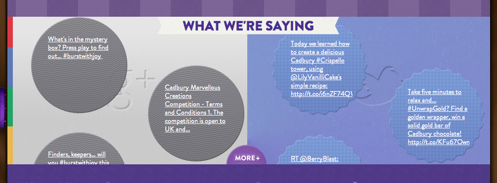
Words i first think of when i look at this website - purple , chocolate , cadburys , cluttered , not engaging
What is the point ? To promote cadburys
What is the purpose of the website? to show you new products the history of cadburys , competitions and recipes.
Who are the target audience? For people who like cadburys , who like the brand and can afford cadburys its an affordable brand. Children as well as adults its a family brand.
I dont like the cadburys websites theres to much going on its not planned very well its cluttered and doesn't make me want to look around the website.
POINT . PURPOSE . AUDIENCE
I found this exercise and what we did in the session beneficial i never really thought about the three things we looked at ( What is the point , purpose & audience) when i generally view a website but it is important. The point is obviously important and it has to fulfil its purpose which leads to - if its for the right audience group.
These are things i will consider when i create my website, i want to make sure it is accessible easy to use , engaging and informative.
No comments:
Post a Comment