AESTHETIC RESEARCH & INSPIRATION
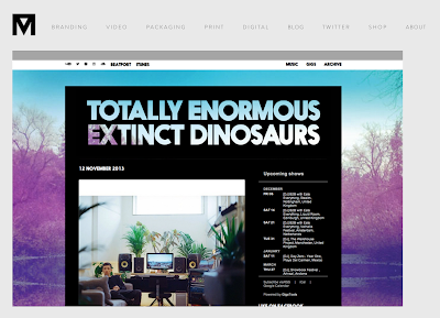
For my aesthetic research i decided to research into mainly music websites as they feature the same type of layout i would want to produce for my own website. These websites reflect appropriate aesthetics because i am creating a website for album artwork.
SBTRKT
I first looked at the SBTRKT website i love the use of monochrome colours and the large squares they've used to display there content and album artwork. I want my website to be similar but I'm unsure if i will have the menu bar the top or somewhere else.
I like how on different pages of the website they use different coloured backgrounds it gives the website more variation. The menu is the same on each page to keep the consistency.
WARE HOUSE PROJECT
This websites aesthetics are minimal and use monochrome colours i love the white line they've used to break up there menu from there content on the page.
CANALL MILLS
There neutral background works well with the colourful images this is something i will consider for my webpage as mine will feature a lot of different images I'm thinking of using grey as its a unisex colour.
DISCLOSURE
I like disclosure webpage because of the colour use and how large the images are. The navigation bar works really well with there bold typeface and the sizing of the navigation in comparison to the main title.
JESSIE WARE
This website uses a lot of negative space. The colour choice works really well with the minimalist aesthetic and i like the way the artists name has been spread out over the top of the content.
KATE MOROSS :
SAM SMITH
This is my favourite website i viewed for album artwork you can play music from the images and its really easy to navigate.


No comments:
Post a Comment