Showing posts with label Design for web. Show all posts

Monday, 2 December 2013

CSS Sprite - Rollover

CSS Sprite Rollover Research

After some research i decided that using a css sprite would be the most efficient method this is also because my website features a lot of images it would also save me a lot of time.

I needed to find the appropriate code to do so. I found this web page that explained the step by step.

http://www.dauid.us/blog/css-image-sprites/


HTML CODE:

<a class="imagesprite" title="Your Image Title" href="#"></a>

This is CCS this is enables it to be sprite.

a.imagesprite {
display: block;
width: 125px;
height: 60px;
background: url(location-of-your-image.jpg) no-repeat 0 0;
overflow: hidden;
text-indent: -15000px;
font-size: 0px;
line-height: 0px;
}

a:hover.imagesprite {
background-position: 0 -60px;
}

a:active.imagesprite {
background-position: 0 -120px;
}


Owl Carousel J-Query Research

OWL Carousel.

I needed a slider for my website i decided to use owl carousel because this website offers code that is responsive and its future proof so if i was wanting to make my website mobile it would work.


This code is used to import the styling and the javascript (jquery)

This code is used for the structure

 This code makes all of the plug ins run.

Friday, 22 November 2013

Research - Grids & Layouts

GRIDS & LAYOUT

Grids and layout are a vital part of designing as they are guidelines where to drop your information and how to

Golden Ratio Fibonacci Sequence -

The Golden Section is an aesthetically pleasing division of space that is often used by artists as the basis for measurements within their composition.

The Golden Section is a ratio which is evident throughout the universe as the number Phi and is also related to Fibonacci Series. You can use this ratio to good effect in design by making sure that elements of your grid conform to this ratio. Using the Golden Section can ensure a natural sense of correct composition, even though it is based in mathematics it will ‘feel’ right.


This sequence is not only evident within design but also nature

The human face follows the ratio we find people whose faces are truer to the ratio more attractive
Classic Renaissance masterpieces from antiquity and even human body parts are proportioned based on the ratio down to the fingers themselves.

Fibonacci sequence a series of numbers in which each number is the sum of two proceeding numbers.

draw two small squares together

draw a third square using the combined lengths of the two original squares together.

continue to repeat the process and the set.

55 point title should be complemented with the 34 point body copy by applying Fibonacci's sequence


A spiral growing out of squares sized according to Fibonacci Series (0+1=1; 1+1=2; 1+2=3; 2+3=5; 3+5=8; etc). This spiral can be found in nature, art, design and architecture.

THE DESIGN GRID:

A construction grid that helps to organize a design area. The design grid makes it easier to design clearly, consistently and with continuity. It is a system of guidelines, borders (margins), and columns into which elements are placed and to which they are aligned. Before document layout begins following design elements should be established:
Format (size of the finished project)

Type area and margins

Columns (column width, column spacing, column height)

Basic typeface and point sizes (number of character in a column)

Column spacing (number of lines in a column)

Dividing the column into grid fields

Margin types

Pagination (number of pages in the document)

Color scheme


Rule of thirds - 

The rule of thirds is a "rule of thumb" or guideline which applies to the process of composing visual images such as designs, films, paintings, and photographs. The guideline proposes that an image should be imagined as divided into nine equal parts by two equally-spaced horizontal lines and two equally-spaced vertical lines, and that important compositional elements should be placed along these lines or their intersections.Proponents of the technique claim that aligning a subject with these points creates more tension, energy and interest in the composition than simply centering the subject would.


WEB: Aesthetic Research & Inspiration

AESTHETIC RESEARCH & INSPIRATION

For my aesthetic research i decided to research into mainly music websites as they feature the same type of layout i would want to produce for my own website. These websites reflect appropriate aesthetics because i am creating a website for album artwork.

SBTRKT

I first looked at the SBTRKT website i love the use of monochrome colours and the large squares they've used to display there content and album artwork. I want my website to be similar but I'm unsure if i will have the menu bar the top or somewhere else.


I like how on different pages of the website they use different coloured backgrounds it gives the website more variation. The menu is the same on each page to keep the consistency.

WARE HOUSE PROJECT

This websites aesthetics are minimal and use monochrome colours i love the white line they've used to break up there menu from there content on the page.


CANALL MILLS


There neutral background works well with the colourful images this is something i will consider for my webpage as mine will feature a lot of different images I'm thinking of using grey as its a unisex colour.


DISCLOSURE

I like disclosure webpage because of the colour use and how large the images are. The navigation bar works really well with there bold typeface and the sizing of the navigation in comparison to the main title.


 JESSIE WARE

This website uses a lot of negative space. The colour choice works really well with the minimalist aesthetic and i like the way the artists name has been spread out over the top of the content.


KATE MOROSS :


SAM SMITH

This is my favourite website i viewed for album artwork you can play music from the images and its really easy to navigate.


Its important to research for aesthetic inspiration as you can consider other problems & solutions you've not thought of for your own content and layout.

Monday, 4 November 2013

WEB - Primary Research

PRIMARY RESEARCH

For my Web brief i have finalised my concept and i have decided to create a archive web page for album artwork.
There are different sections of research that need to be conducted in order to gain the best possible body of work to make my website successful and audience appropriate. 

Like looking on the web to see whats out there i decided to go into leeds city center gather some primary research. I firstly went to Jumbo Records the store is pretty dated and had lots of really old vinyls and a few up to date.


Inside the shop - 


Display - 
I wanted to try and find some geometric album art that i hadn't seen before i found this that i thought was interesting.

 Lots of the geometric album artwork i hadn't seen before I'm glad i came to have a look in a record store as i wanted to get a few images for each of my main categories  - geometric art , photo manipulation & typography based.

 I really loved this particular album artwork , i want to take inspiration from this and other similar geometric design to incorporate into my website.
 Photo manipulation - psychdelic 
 I also loved this piece it looks as though it has been done on the laser cutter.

After doing some primary research in this record store i decided to try and find somewhere a bit more age approbate and try and find some really nice design examples that i would want to use on my website.

URBAN OUTFITTERS PRIMARY RESEARCH

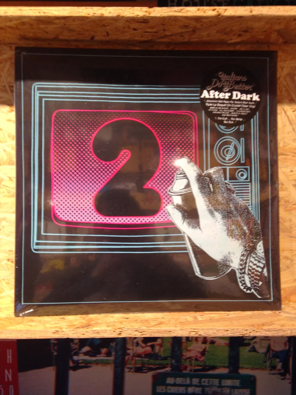
I next looked at an album section in urban outfitters. I felt this would be more appropriate because there shops is more unique and diverse so i felt there would be more of a selection.


There shop features a modern style room with wood sections for the individual records and a record player.
They had some new viynls like this disclosure one. 
 I like the use of colours on this specific vinyl and the black coloured packaging.


I found it quite interesting how i only found a few geometric designs and very limited typography based artwork.I think this primary content has pushed me to research even further in depth and go with this concept in creating a album art archive.