ASOS - APP RESEARCH
For my Asos brief i decided to research into an APP i have came across called ASAP. This will help focus the style of my app more so i can design it with a bit more structure. looking at the way the app uses its navigation also the sub categories.
This is the landing page for the app. Before you have signed up so you can scroll across the features off the app.
'look for items by using the visual search tool sharing the top finds with your folllowers'
'follow friends and style muses to discover their fashion searches''Ask our team of experts to also help hunt down those items you desire'
'Sign up to begin'
'Here you put in your details'
'Follow 'Asapers' ( People who already have an account)'
'Invite Facebook friends'
'This page is to show you how you take images of things you want. This screen shot shows someone else's profile'
You can search user name or colour
Tab for notifications . If people follow you ect.
On the more section there are a few options like below:
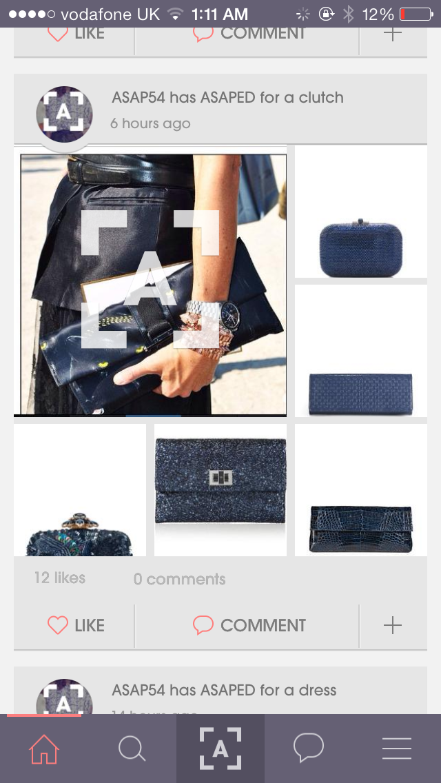
When exploring its slightly like Instagram, its possible for you to search through colour and images.
This app works really well its functional and highlights all the strong points of a fashion app. I think with it using purple colours it does make it unisex but at the same time from the app i feel as though its quite feminine. They use images of women throughout. The layout of the main image you take a picture of and then the images surrounding it work well.


No comments:
Post a Comment